Echizen Washi brand, rooted in a region renowned for its expertise and technology and with a 1500-year history of excellence, sought a brand identity that could express its values to the world and future generations. With the London- and Tokyo-based studio Anyhow, I wanted to visually represent a close-knit community of craftspeople with diverse expertise and the collective ability to meet any challenging need.
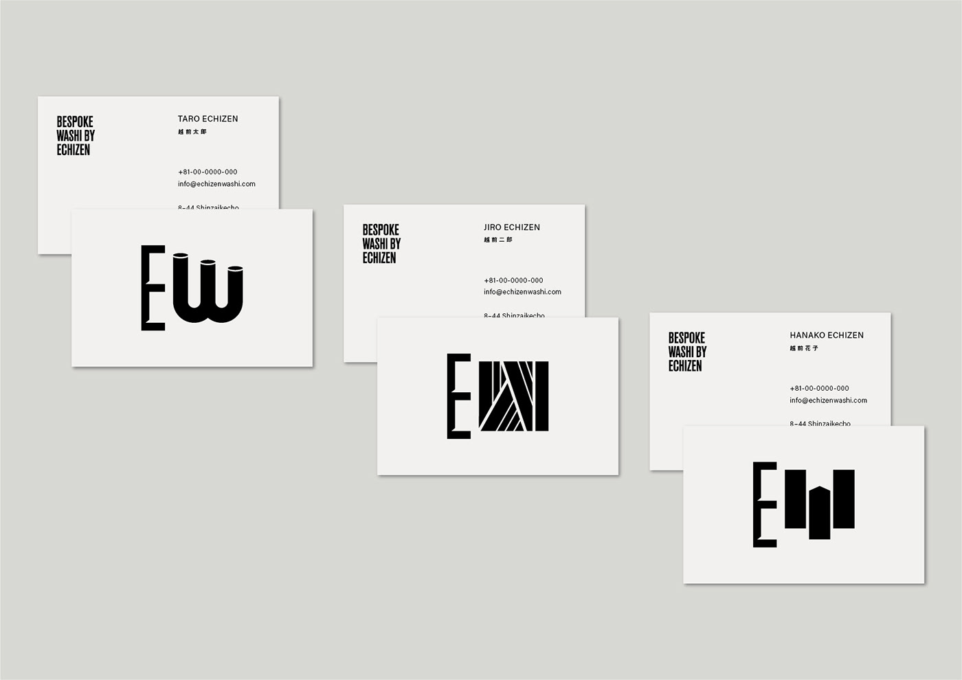
The design for the E of Echizen is inspired by the traditional tool for making Washi paper. The W for Washi represents the manufacturing process of Washi paper. The movement of the design gives the impression of anticipation. Also, the design of the letter W varies according to where it is used. This reflects the versatility of Echizen Washi and how it can accommodate customers' needs.